Studio 5678
Studio 5678
Brand Identity Design
2025
At Studio 5.6.7.8, dance is a place where creativity, friendship, and confidence take center stage. Studio 5678 has been making memories for 35+ years and counting. This dance environment was created by instructors who are passionate about teaching and creating a positive space where kids can learn, grow, and express themselves. They are dedicated to providing top-quality dance instruction for students ages 2 and up.
The Challenge
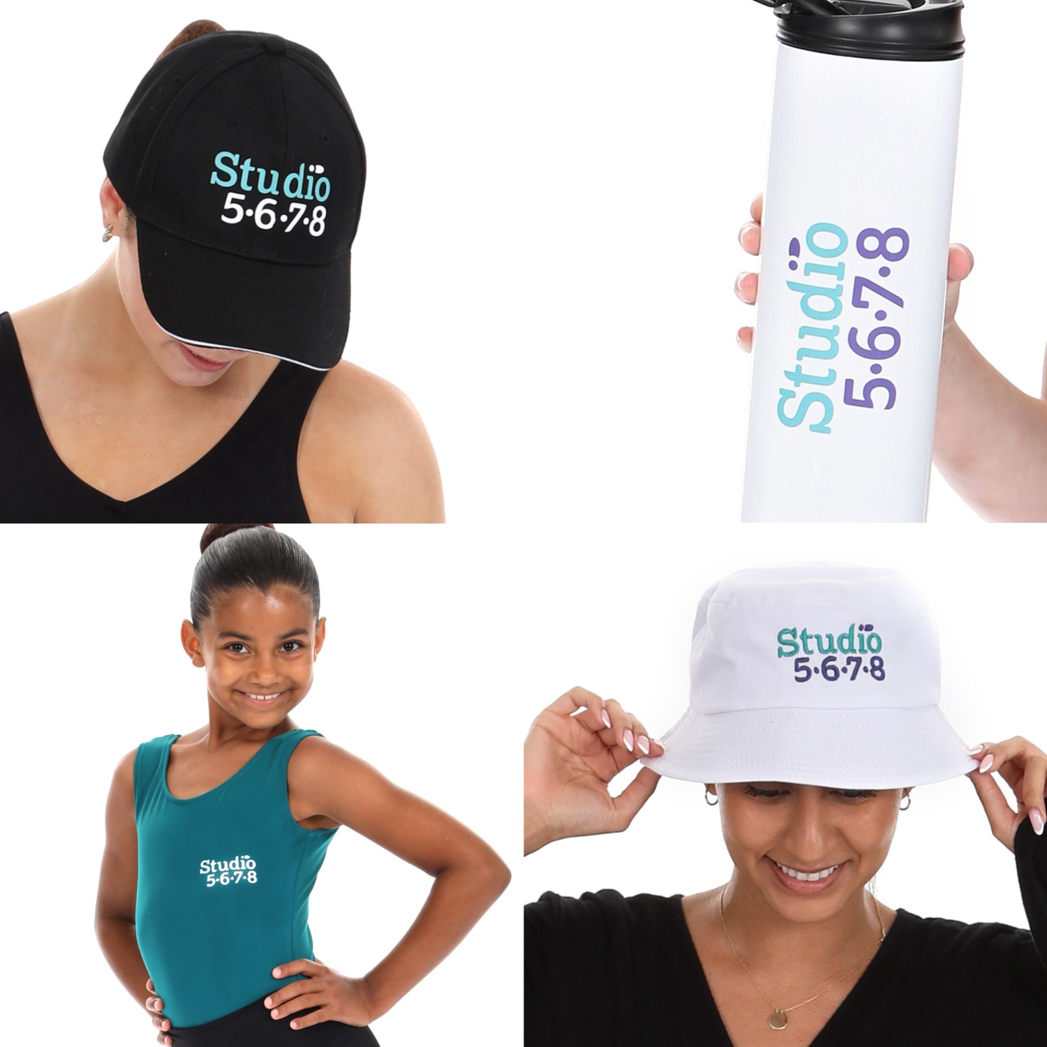
5678 came to me to give them a fresh new look. The old logo deserved a refresh due to it lacking scalability. At small sizes, the old logo was hard to read because of its thickness, curved base-line, and issues when printed on certain materials. Everything created in this project was made to be modern but not steer far from the friendly feeling the brand gives.
The Solution
The original logo mark was dated and in need for a change. The inconsistent baseline of the letters in the typeface and the angle of each level of hierarchy is what makes this logo chaotic. At smaller sizes the thin letter stems lose their visibility and causes issues when printed. By solving this, we evened out the baseline, and kept a consistent thickness in the font. While modernizing the logo mark, we kept the welcoming feeling by including the footprint from the old logo. The callback to Studio 5678's roots by including the footprint emphasizes a "step in the right direction" and movement to support the Studio's mission.


" height="78px" id="NXVy5Veia" width="71px"/></svg>)